Shopify UX optimization: the improvements that move conversion in 2026
E-commerce, Ux/ui Design
Mar, 17 2026
Shopify UX optimization: the improvements that move conversion in 2026
Most Shopify stores don’t have a traffic problem. They have a UX problem.
The average Shopify store converts just 1.4% of visitors into customers, according to Littledata’s analysis of 2,800 stores. Top-performing stores — the top 20% — convert at 3.2% or more. The top 10% reach 4.7% and above. That gap is not primarily a product problem or a traffic quality problem. In the majority of cases, it is a UX problem: friction in the wrong places, trust signals missing at the wrong moments, and experiences that ask too much of the user before they’ve decided to buy.
This guide gives you a structured framework to audit your Shopify store’s UX — and to understand which improvements move conversion, which are cosmetic, and when UX issues point to something deeper that standard tools can’t fix.
Why UX is a revenue number, not a design opinion
UX decisions have direct, measurable revenue consequences. A few data points that frame what’s actually at stake in 2026:
$260 billion in lost orders across the US and EU alone could be recovered through better checkout design, per Baymard’s research.
Sites that load in under 2 seconds see 35–50% higher conversion rates than slow competitors. A one-second delay in load time reduces conversions by approximately 7%.
Mobile accounts for 79% of total traffic to Shopify stores, yet mobile conversion averages just 1.2% vs. 1.9% on desktop — a gap that points directly to mobile UX friction.
Stores converting above 3.2% are already in the top 20% of all Shopify merchants. Optimised stores regularly achieve 4–5%+ — more than triple the average.
The difference between 1.4% and 3.2% conversion is not a small improvement in aesthetics. On a store doing $500,000 in annual revenue, it is the difference between that number and over $1.1 million — from the same traffic. That is the business case for taking UX seriously as an operational priority.
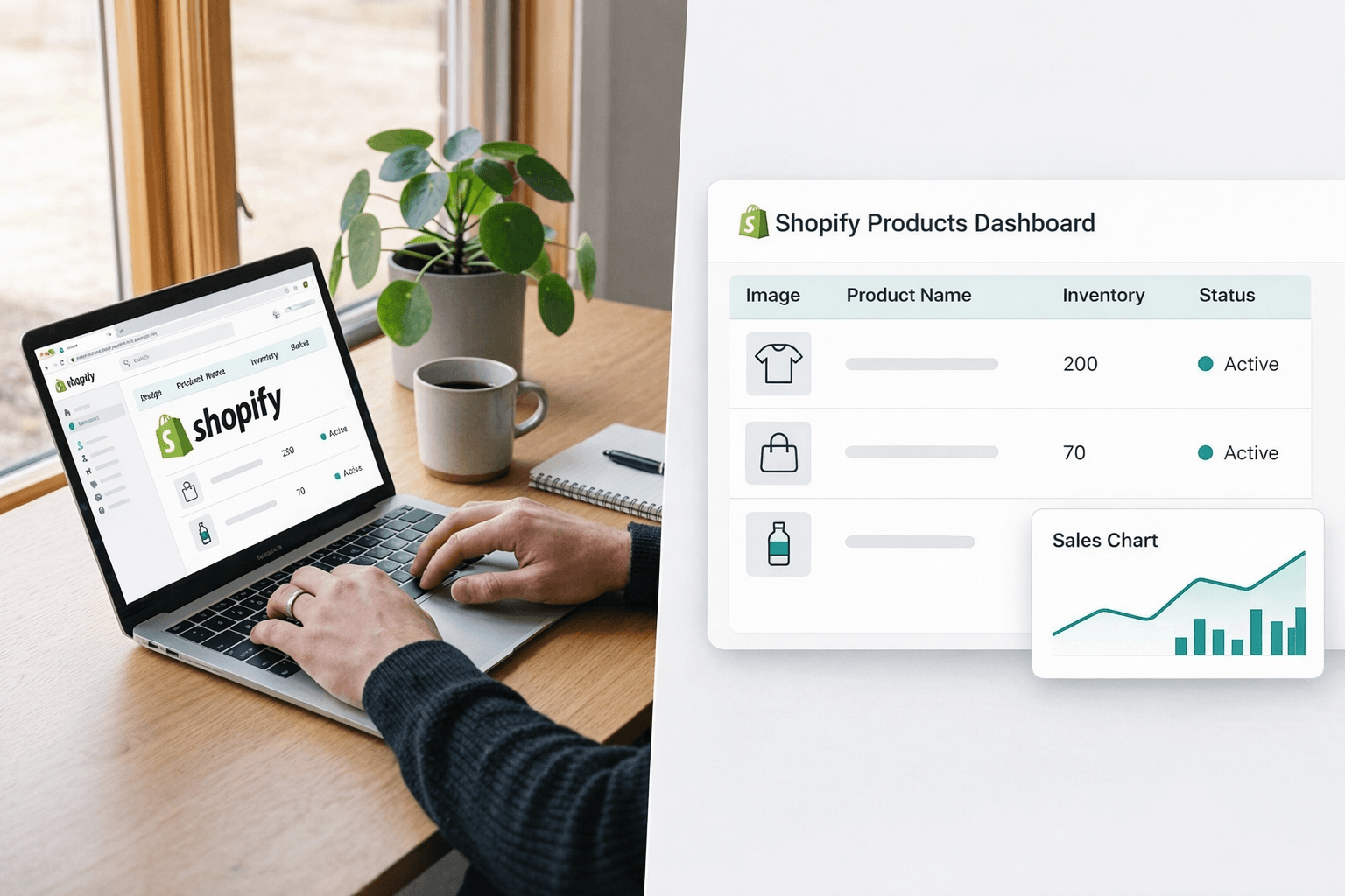
The Shopify UX audit framework: 10 areas to review
This is not a generic checklist. It is a simplified version of the structured UX audit process used by professional Shopify agencies — built around the areas that consistently produce the largest conversion gaps across stores of different sizes and business models.
1. First impression: what users understand in 5 seconds
Show your homepage to someone unfamiliar with your brand and ask three questions: What does this store sell? Who is it for? Why should I buy here rather than somewhere else? If they hesitate on any of these, your above-the-fold UX is leaking potential customers before they’ve seen a single product.
The most common issues: a hero banner that prioritizes aesthetics over clarity, a value proposition that exists only in the footer, and a navigation structure that makes sense to the brand team but not to a first-time visitor. Research shows 94% of first impressions are design-related — but in ecommerce, “design” means clarity and trust, not visual beauty.
What to check: Value proposition visible above the fold. Navigation limited to 5–7 clear top-level categories. Primary CTA unambiguous on both desktop and mobile.
2. Navigation and information architecture
A user should be able to reach any product within 2–3 clicks from the homepage. On mobile, mega-menus are a conversion killer: they block the screen, slow down the interaction, and increase the number of taps required to reach a product. The stores that consistently perform well on mobile navigation use simple, flat category structures with a prominent search bar as the primary discovery mechanism.
What to check: Time and clicks to reach a product from the homepage. Mobile navigation behavior at 375px viewport. Search bar visibility on mobile.
3. Product pages (PDP) — where conversion decisions are made
Your product page is the single most important conversion point in the store. Adding product reviews alone can increase conversions by 10–15%. The threshold is simple: above the fold on desktop and mobile, users need to see the product name, price, a clear add-to-cart CTA, and at least one trust signal — without scrolling.
Common Shopify PDP failures: generic theme layouts that bury the CTA below the fold on mobile, product images that are too small or lack lifestyle context, no social proof near the purchase decision, and shipping or returns information hidden in the footer.
What to check: CTA visible above the fold on mobile. Reviews present and near the CTA. Shipping cost and delivery estimate visible before checkout. Product video or multiple-angle imagery available.
4. Search and filtering — the hidden conversion driver
Up to 43% of ecommerce visitors go directly to search — and they convert at a significantly higher rate than browsers, because intent is higher. Yet most Shopify stores treat search as an afterthought.
Native Shopify search does not handle typos, synonyms, or intent well at catalog sizes above 500 products. If a user searches “grey sneakers” and your products are tagged “gray trainers,” they see nothing and leave. Filters with too many options, inconsistent facets, or no logical hierarchy produce the same result.
What to check: Typo tolerance (test with common misspellings of your top products). Synonym handling. Filter structure — are filters relevant to how customers actually shop your catalog? Mobile filter UX.
5. Mobile UX — where most revenue is actually lost
Mobile drives 79% of Shopify traffic but converts at 1.2% on average versus 1.9% on desktop. That gap represents a structural revenue opportunity for almost every store. The causes are predictable: small tap targets, forms that require too much manual input, intrusive popups that are difficult to close on small screens, and checkout flows that weren’t designed for thumbs.
One practical test: attempt to complete a full purchase on your store using one hand on a 375px device. Count the number of taps, the number of form fields, and any moment where you had to zoom or re-tap. Each friction point is a conversion drop.
What to check: Tap target size (minimum 44x44px per Google guidelines). Checkout form field count on mobile. Popup close buttons accessible without zooming. Digital wallet options (Shop Pay, Apple Pay, Google Pay) enabled at checkout.
6. Checkout UX — the biggest single revenue lever
Baymard Institute data from 2026 identifies the top reasons shoppers abandon checkout:
Unexpected costs (shipping, taxes, fees) revealed at checkout — 48% of abandonments
Forced account creation before purchase — 26%
Checkout process too long or complicated — 22%
Insufficient payment options — 13%
Three of these four are directly fixable without custom development: show shipping costs early (on the product page or cart), enable guest checkout, and add digital wallets. Shop Pay converts up to 50% better than standard guest checkout and reduces abandonment by 10–15% for returning customers.
A shorter checkout with fewer form fields and no surprise fees can realistically lift conversion by 20–35% — one of the highest-ROI improvements available on standard Shopify without any custom code.
What to check: Shipping cost visibility before the checkout page. Guest checkout enabled. Shop Pay and digital wallets active. Number of form fields. Trust signals (SSL badge, returns policy) visible on the checkout page.
The most common causes of Shopify speed problems: too many installed apps (the average Shopify store runs 15 apps; each adds JavaScript and external requests), unoptimized product images, render-blocking scripts, and themes with heavy unused code. Removing unnecessary apps alone typically improves load time by 20–30%.
What to check: Google PageSpeed Insights score for mobile and desktop. Core Web Vitals: LCP under 2.5s, INP under 200ms, CLS under 0.1. App count — audit quarterly and remove anything not actively earning its place.
8. Trust signals
Trust is not built on the checkout page — it’s built throughout the browsing journey, and lost in the moments where users look for reassurance and don’t find it. The highest-impact trust signals for ecommerce are: verified customer reviews near the purchase decision, clear and accessible returns and refund policies, visible shipping timelines (not just “ships in 3–5 days” but actual expected delivery dates), and payment security indicators at checkout.
What to check: Reviews visible on PDPs. Returns policy accessible from product pages, not just the footer. Shipping timeline clarity. Payment icons and security badges on the checkout page.
9. UX consistency across the funnel
Inconsistent UX — different button styles, typography shifts, or layout changes between pages — breaks the sense of reliability that drives purchase confidence. This is especially visible in stores that have grown through multiple theme edits, app additions, and one-off customizations over time. Each change made in isolation can produce a store that feels like three different websites stitched together.
What to check: Visual consistency from homepage → collection → PDP → cart → checkout. CTA button style and copy consistency. Typography and spacing consistency across page types.
10. Technical limitations — when UX problems need custom solutions
Not all UX problems can be solved with theme edits, app installs, or checkout settings. Some are structural — rooted in what Shopify’s standard architecture can and cannot support for a specific business model.
The clearest signs that a UX problem has become a platform limitation:
Your product requires a configurator or visualizer that lets customers build and preview their order in real time — no theme or standard app handles this cleanly
Your checkout needs different behavior for different customer types (wholesale vs. retail, B2B tiers, subscription vs. one-time) — standard checkout logic cannot accommodate this without fragile workarounds
Your catalog is large and complex enough that native search and filtering consistently fail to surface relevant results — requiring a custom search architecture
Your account experience needs to function as a self-service portal for B2B buyers — managing teams, approvals, and order history in ways that go beyond native Shopify customer accounts
In these cases, the UX problem is real and measurable, but the solution is not a better theme or a different app. It is custom Shopify development — building the specific functionality your business model requires.
What this audit framework is built on
This framework reflects the recurring patterns identified across Shopify UX audits of stores at different traffic levels, catalog sizes, and business models — mapped against research from Baymard Institute, Nielsen Norman Group, and Google’s Core Web Vitals guidelines. The underlying principle is consistent: prioritize the changes that affect revenue first, and separate structural problems from cosmetic ones before allocating development budget.
Most Shopify UX advice skips this prioritization. It tells you to add reviews, compress images, and simplify navigation — all of which are valid — without telling you which of these is actually costing you the most revenue right now, or which requires a developer versus which you can change this afternoon.
A proper audit answers that question with data. And in most stores, the biggest opportunities are structural — not visual.
How a professional Shopify UX audit goes deeper
A self-audit using this framework is a strong starting point. A full professional audit goes further — and connects UX issues directly to revenue impact rather than subjective design judgments.
A structured Shopify UX audit includes: user behavior analysis from session recordings and heatmaps, funnel drop-off mapping by page type and device, PDP and checkout optimization review against conversion benchmarks, mobile-first usability analysis, search and filtering architecture assessment, and a technical limitations review that identifies what can be solved with standard tools and what requires custom development.
The output is not a list of design suggestions. It is a prioritized list of issues ranked by estimated revenue impact, with a clear distinction between quick wins (changes you can make in days) and structural improvements (changes that require development investment but deliver compounding returns).
Not sure where your store is leaking revenue?
Get a structured Shopify UX audit
We’ll identify exactly where users drop off, what’s blocking conversion, and which fixes will have the biggest revenue impact — with clear guidance on what requires development and what doesn’t.
Shopify UX optimization is the process of improving the user experience of a Shopify store to increase conversion rates and revenue. It covers homepage clarity, navigation structure, product page design, search and filtering, mobile usability, checkout flow, page speed, and trust signals. Unlike visual redesigns, UX optimization is focused on removing friction that prevents visitors from completing a purchase.
The average Shopify store converts 1.4% of visitors, according to Littledata’s analysis of 2,800 stores. Stores in the top 20% convert at 3.2% or more. The top 10% reach 4.7% and above. Optimized stores regularly achieve 4–5%+. A conversion rate above 3.2% means your store is already outperforming 80% of Shopify merchants.
The average cart abandonment rate is 70.19%, based on 48 studies aggregated by Baymard Institute. The top reasons: unexpected costs at checkout (48% of abandonments), forced account creation (26%), a checkout process that is too long or complicated (22%), and insufficient payment options (13%). Three of these four can be addressed without custom development — by showing shipping costs early, enabling guest checkout, and adding digital wallets like Shop Pay.
Significantly. Sites loading under 2 seconds have 35–50% higher conversion rates than those loading in 5 seconds. A one-second delay reduces conversions by approximately 7%. On mobile, 53% of visitors abandon pages that take more than 3 seconds to load. The most common causes on Shopify are too many installed apps, unoptimized images, and heavy themes. Removing unnecessary apps typically improves load time by 20–30%.
The highest-impact improvements, in order of typical ROI: (1) Checkout friction reduction — showing shipping costs early, enabling guest checkout, and adding Shop Pay can lift conversion by 20–35%. (2) Page speed — getting load time under 2 seconds can double conversion rates. (3) Product page trust signals — adding reviews near the CTA increases conversions by 10–15%. (4) Mobile UX — reducing tap targets and form fields addresses the biggest traffic/conversion gap in most stores.
When the UX problem is caused by a platform limitation rather than a design or configuration issue. Clear signs: your product requires a real-time configurator or visualizer; your checkout needs different logic for different customer types; your catalog requires search architecture that native Shopify cannot handle; or your customer accounts need to function as a self-service B2B portal. In these cases, no theme edit or app combination will solve the problem — custom Shopify development is the right path.